Exercise 1 – Observation
For our first exercise we were to chose a surface close by to us (in the home) and to observe it for 10-15 minutes. Whilst observing we were to note the qualities of the surface such as materiality, lighting, feel, temperature, patterning and atmospheric qualities.
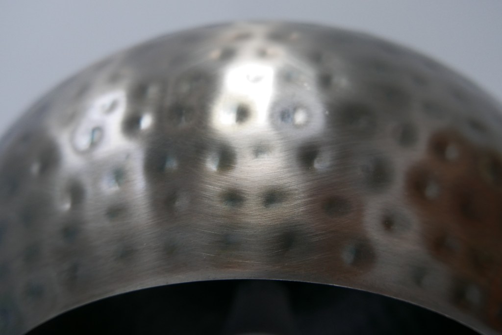
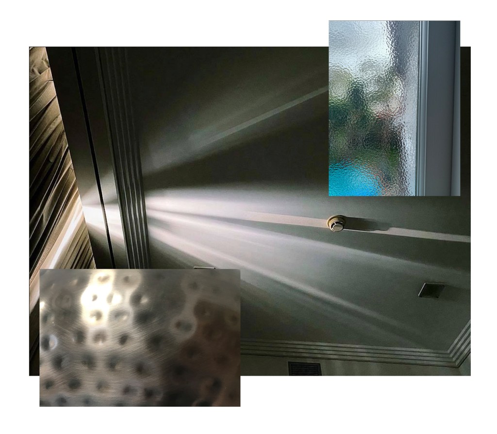
I decided to take a photo of a light shade that hangs above the kitchen counter in my apartment. As the sun moves outside the kitchen windows, the light across the surface warps and shifts around the indented pattern. As the light shifts the colour slightly changes too. It’s cold to touch and despite the surface looking as if it would be kind of rough and scratchy it is actually very smooth to touch.
Group Exercise
We were then put into groups online of 3 or 4 and asked to discuss our individual images and create composite drawing of our surfaces.
Observing the images together there is a theme of distortion of light in all of them. The light coming through the blinds gets distorted and splayed out in varying directions to what it would naturally flow in through. On my image the light distorts around the pattern on the light shade and the surface of the glass window acts as a kind of filter for light too.
Exercise 2 – Making
For making my first surface I wanted something that used layers and would be tactile. Using Gesso, Twine and a piece of card I created a layered surface with a rough and weathered kind of look. I think The images close up show this surface better as you can get more of a feel for the rough nature of the twine and in turn the feeling of wanting to see if it feels as it looks.
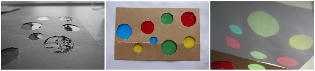
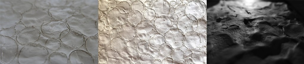
For my second surface I wanted to create something that focused not so much on the thing I made but the surfaces that could come from that, such as the shadows created. Using card and cellophane I made a simple surface with cut out holes that were covered in varying colours. On its own this surface is nothing special but when light shines through it creates coloured shadows of the circles onto another surface. This transfer of surfaces really intrigued me as my artist model, Liz West, creates a similar effect with many of her works. The cellophane also has a reflective element which we can see in the first image in black and white. This simple quality enhances the otherwise simple surface and gives it some illusion of depth.
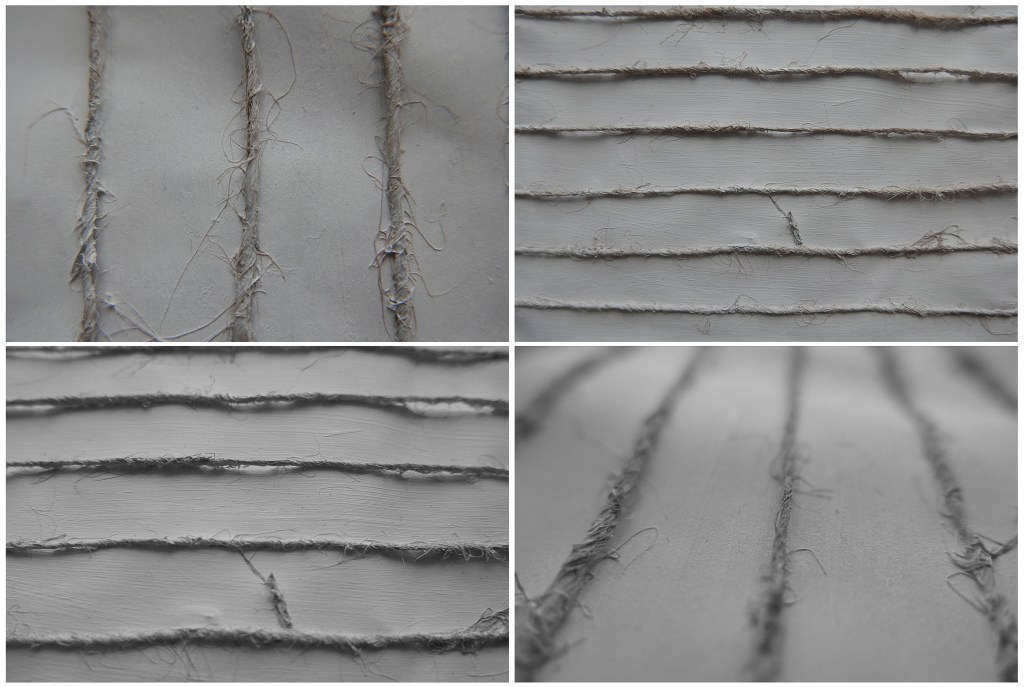
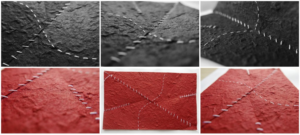
My third surface was an already textured paper that I then sewed over top of to create layers and manipulate the natural curvature of the paper. Having cut into the paper at certain spots and then sewing it back together, the paper was able to bend and flex in different directions and then also return to its original shape giving the surface a sense of fluidity and movement.
After a group discussion about our surfaces I was given several ideas about other materials that could create some really nice surfaces. Several of my group-mates had used things I wouldn’t have thought of such as glue, water, ceramics, digital media and many more.
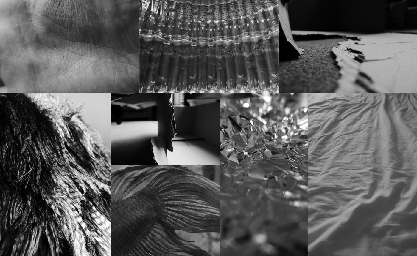
This discussion and the work of my group inspired me to look for more surfaces around me to see if I could draw aspects out of them for further exploration. With camera in tow I searched high and low around my apartment to explore the surfaces I don’t give a second thought to from day to day. I was pleasantly surprised, many of the things I thought were the simplest of surfaces turned out to be my favourite, like a ripped cardboard box waiting to be taken down to the recycling bin.

Top row: Skin, clothes dryer, cardboard box
Bottom row: Pillow, cardboard box, fish tail and scales, tinfoil, sheets
Exercise 3 – Observation of artist model
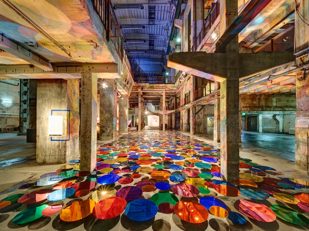
Next step was to observe again Liz Wests installation Our Colour Reflection. – The work transforms the whole space, it goes from being a cold and harsh concrete room, too feeling warm, bright and playful. It creates a space that invites you to explore.
– The transformed surfaces are all different. The colour and light reacts with the edges and corners of the site to distort the shapes created by the discs.
– When you look closer at the discs themselves the room is reflected in disjointed layers adding to the playful aspect of the installation.
– Despite being concrete the surfaces look fluid, the lack of uniformity of the reflected colour adds a soft feel.
– Bright, Rainbow colours are playful and youthful
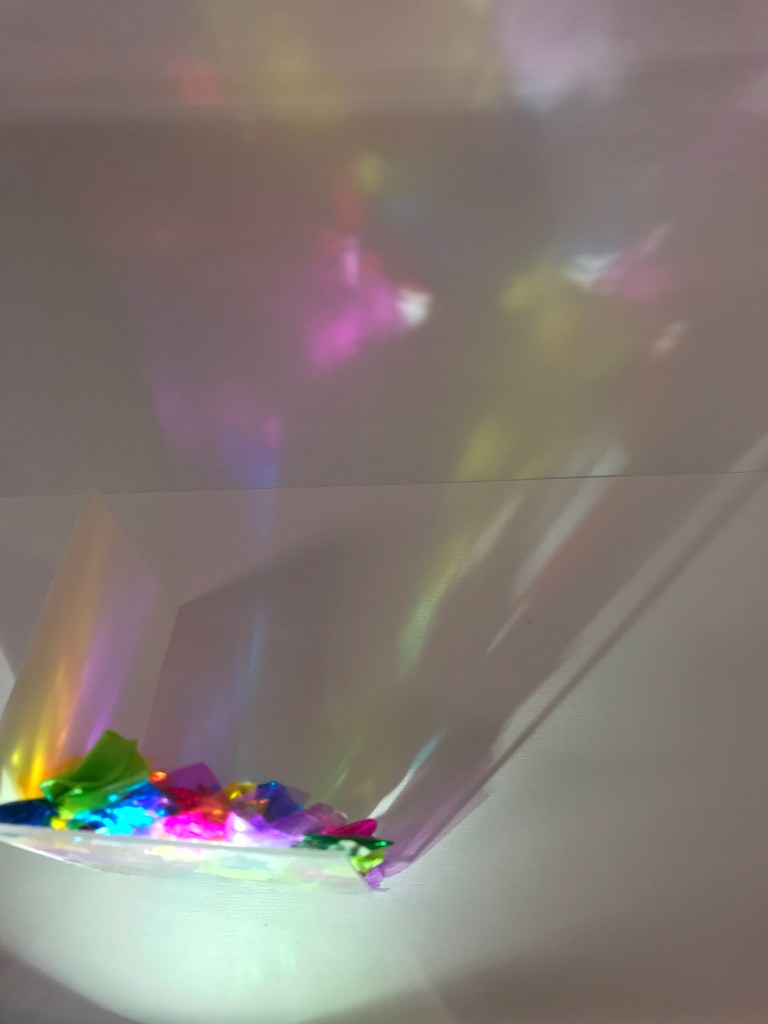
Reflecting on one of the models I made based off of Liz West’s work I noticed the distortion of the reflected colour and also the sense of playfulness in it and decided to focus on this moving forward.
Exercise 4 & 5 – Making & Lighting
My next surfaces were focusing more on the theme of distortion and a sense of playfulness. I ended up making more than necessary as I wanted to cover a range of ideas and see the outcomes of them all and really let myself experiment with them. Once finished I then took some images in different lighting to see how they would react.
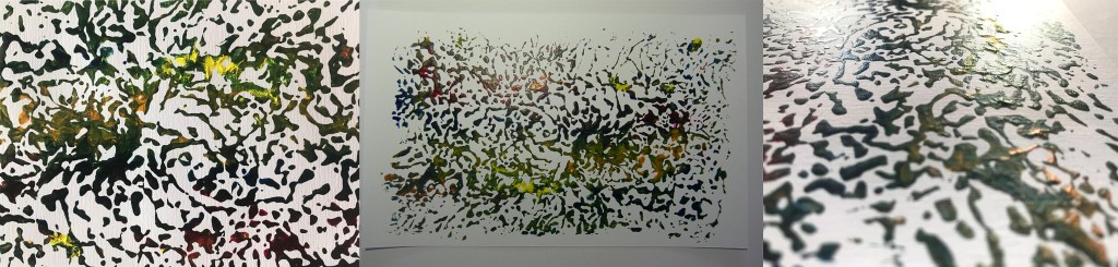
Looking at creating depth and distortion.
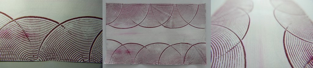
I used a piece of scrunched tinfoil layered with paint to then press this pattern onto a piece of white paper.
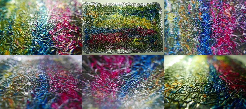
This tinfoil was pressed onto a piece of white paper to transfer the paint. The tinfoil in itself creates another surface however looking at the two images its not immediately clear that one created the other.
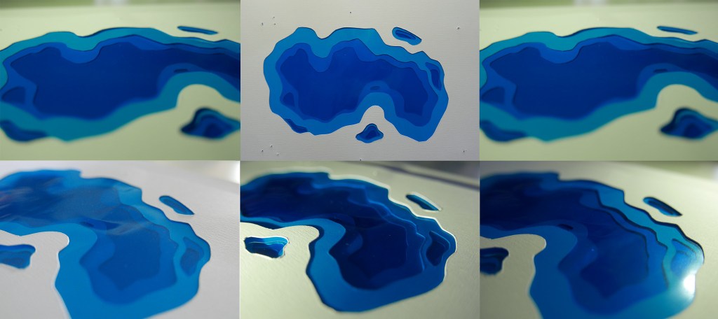
Taking the circular aspect of the coloured discs and putting it on a tactile material.
With this surface I wanted to explore an art deco feel, which is the same era as the St James theatre was built in.

Leave a comment