
After creating a series of surfaces in week 5 I started to look at how I could apply to them to site. I knew from early on that I wanted to create an installation in the space and an exercise we did in week 4 – models based off our artist models work- had given me a few ideas of roughly what I wanted to create.
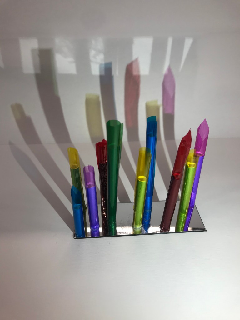
The first model I created in week 4 I imagined as an installation that people could walk through and the coloured beams could be manouvered through or potentially pushed aside (dependant on material). Alternativley it could also be a ceiling or wall treatment and act in a similar fashion but this was an idea I wanted to look at further and potentially develop.
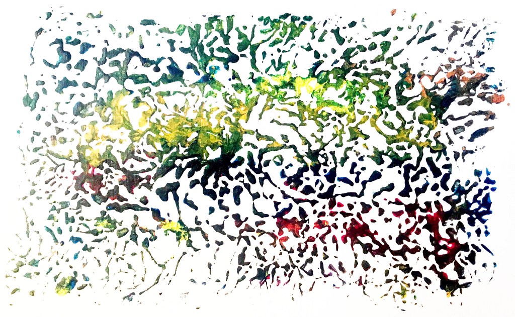
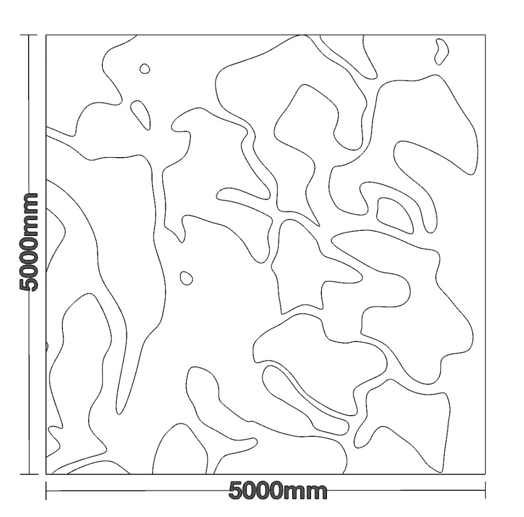
Looking at one of my more abstract surfaces (shown below) I started to think of how it could look if the pattern was to be transformed into a more 3D shape.
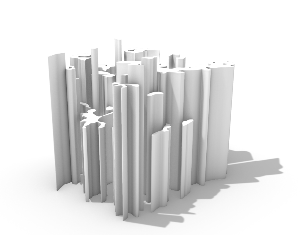
I imported the image into Rhino and traced around the lines of the paint which created a series of unique shapes. I then turned these into surfaces and extruded them to a few different heights to create the model shown on the right below.
I wanted to trace directly over the painted surface to further incorporate that specific surface directly into the design and help it feel authentic.
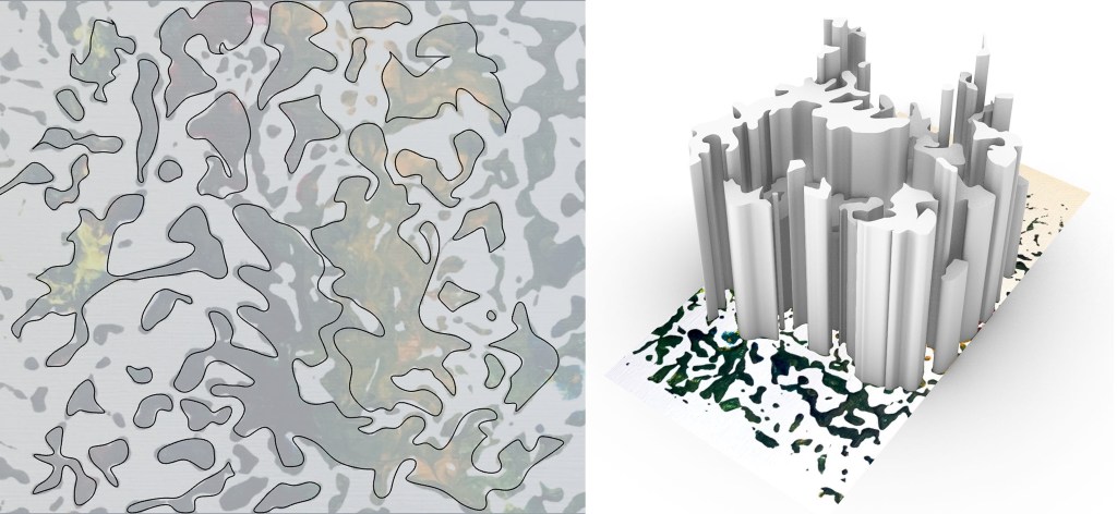
Right: Extruded surfaces above original surface image
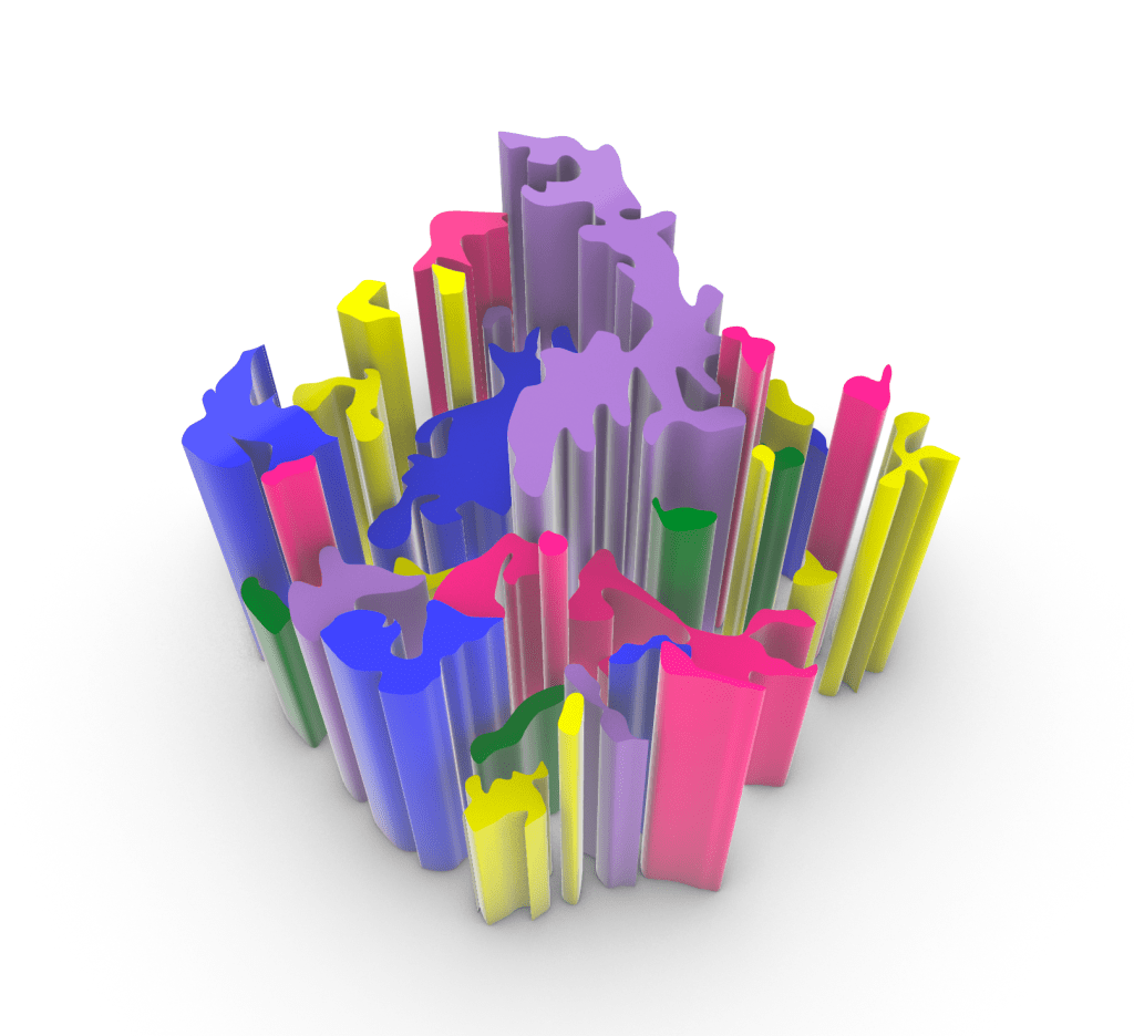
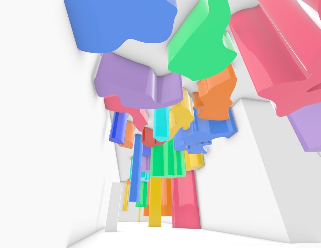
My artist model works with a lot of vibrant colours and I want to incorporate this into my installation. I applied a simple painted material to the surfaces in Rhino in varying colours and was able to get an idea of how it might look. I want the overall look to be playful and inviting so the colour helps with this.

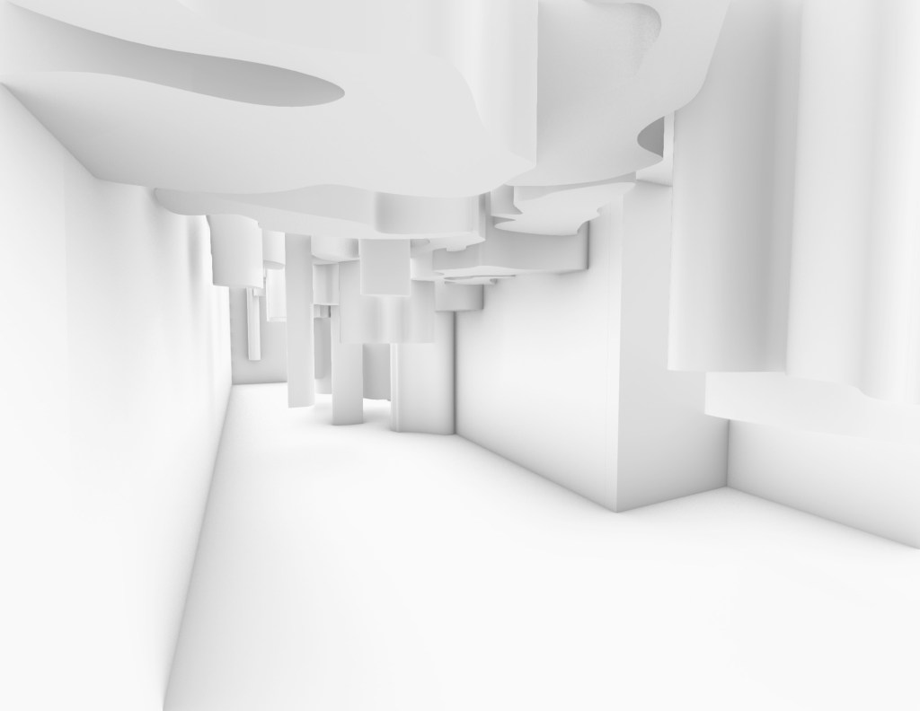
Next I placed the design into my Rhino model of the St James Theatre to try and get an idea of where it should be situated. I was undecided whether I wanted it to be a floor or ceiling surface but after seeing iton the ceiling I realised I preferred that. I copied the original design to created an extended version that would cover the ceiling of most of the site. However I wasn’t too sure I liked it that much, it looked too repetitive and a bit busy for what I really wanted.
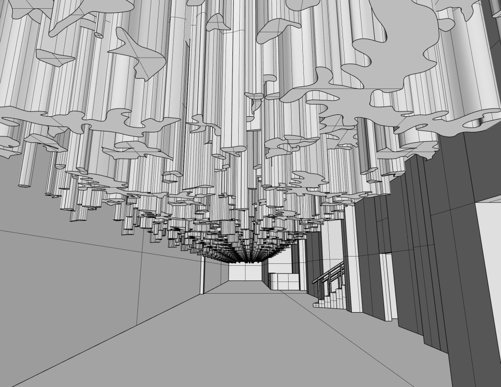
View from Lorne Street entrance towards Queen Street
View from Queen Street entrance towards Lorne Street
I wondered what it would look like if the design wrapped itself around the site so decided to try adding it to the left wall as well as the ceiling. I think this was way too busy for what I wanted, especially when the colour was added and the amount of repition in the shapes.
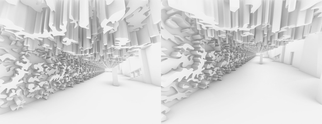
View from Lorne Street entrance towards Queen Street
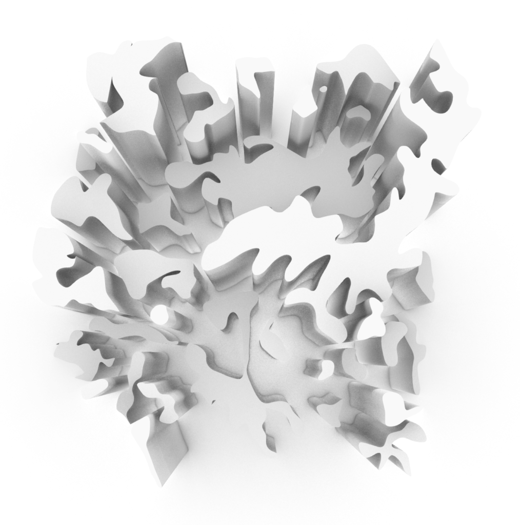
Moving on from the first design, I scaled up the original image that I drew over to fit the whole length of the site. Once I had the size right I went back in and traced over/around the painted surface to create a different series of line work. I much prefer how this one turned out. The spacing and size is more abstract and I prefer how there isn’t repitition in throughout the space.
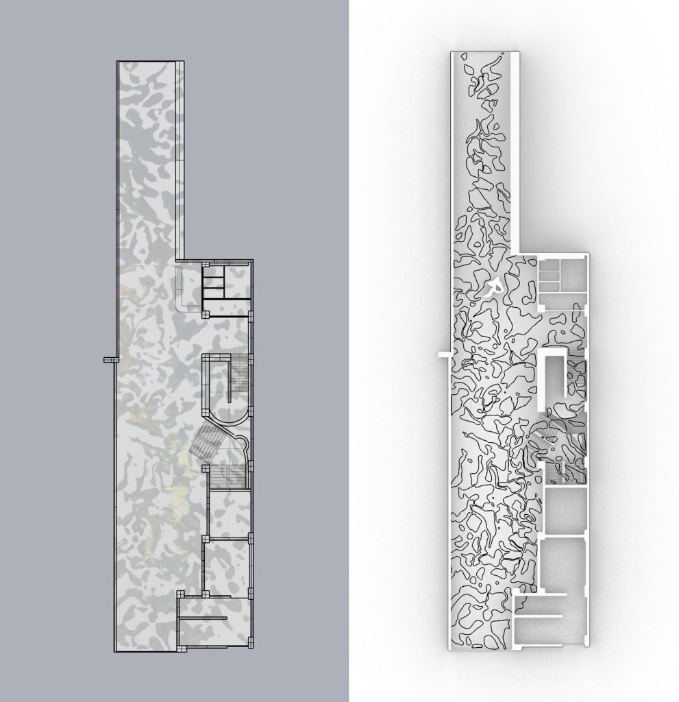
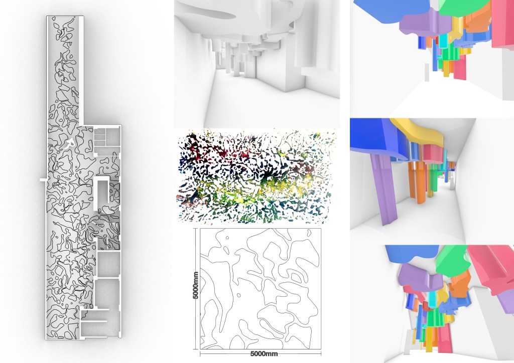
Right: Plan view showing line work that will become the installation
The size of the surfaces is quite large but I think considering how big the site is, the large shapes work better than the original smaller ones that I tried. Below is a scale showing the rough size of several of the surfaces.
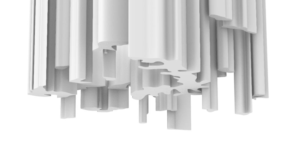
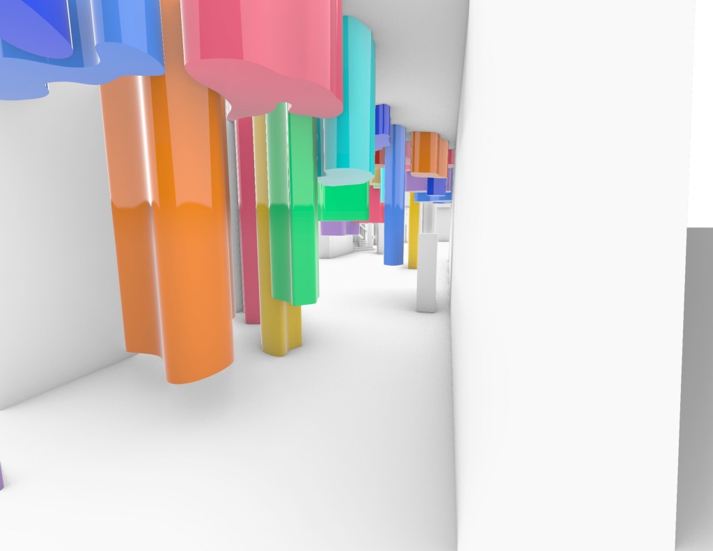
Once I had the lines drawn on Rhino I turned them into surfaces and extruded a section of them down to varying heights creating a kind of maze through the space. As the ceiling is 4m high it gives me quite a lot of room to play around with the different heights without intefering with the large majority of visitors to the site.
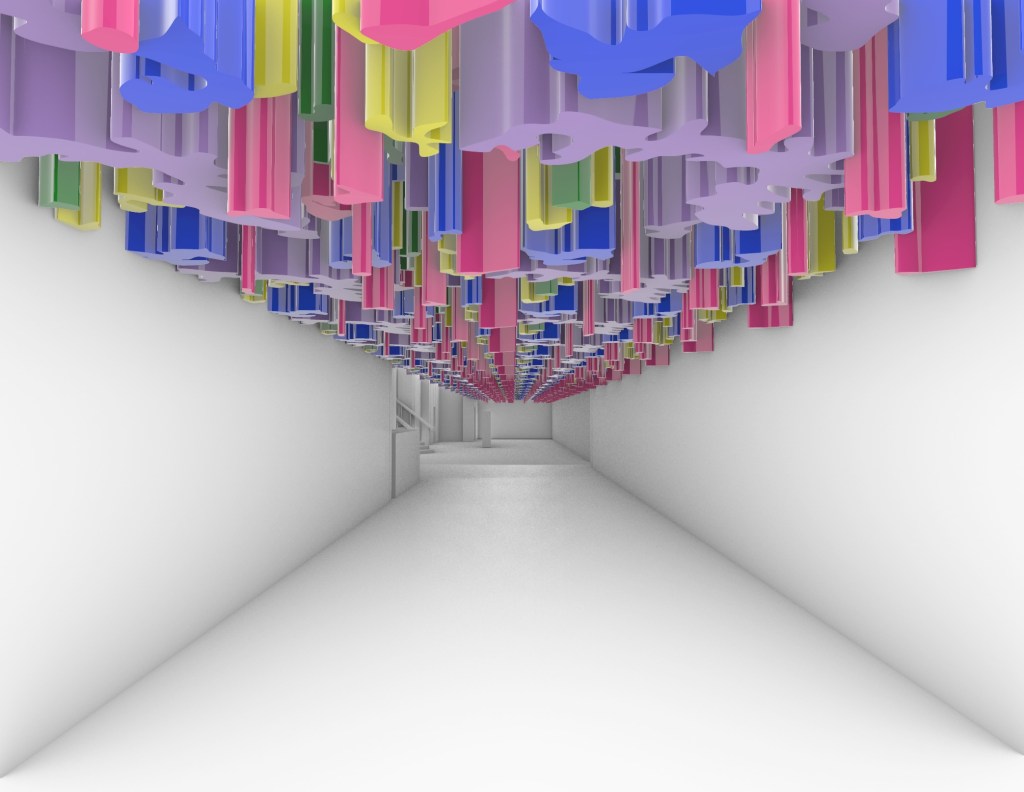
I started by testing out the design on one end of the site to see if I liked it then proceeded to add the colours back into it. I want the overall design to be playful and unique, something eye catching and bright to encourage people to visit the space. I think the mix of colours achieves this effect and would brighten up the space considerably.
Scale ‘person’ shown (white block on ground level on the left)
Scale ‘person’ shown (white block on ground level on the right)
I then created an A3 drawing showing my intended surface, it’s location on the site plan and a scale view.
On Tuesdays class in week 7 we discussed in groups our A3 drawings to talk about our ideas and give/recieve feedback and suggestions. I found this group work to be really valuable and I think everyone in the group was very willing to both give and recieve some feedback and ideas on what each design could potentially be developed into or any helpful suggestions. I was given a few ideas that I want to look into incorporating into my design as I develop it further. Suggestions such as lighting, materials and colour but so far I’m happy with where my design is at and what I can add to it to improve.

Leave a comment