
As our presentation for this project is a bit different than usual I wasn’t too sure how to best present my work. I started by looking at some presentation boards online to try and get some inspiration. They all seem to follow a similar layout, but obviously this is because this works, the ideas are clear and get across whatever it is that is being presented.
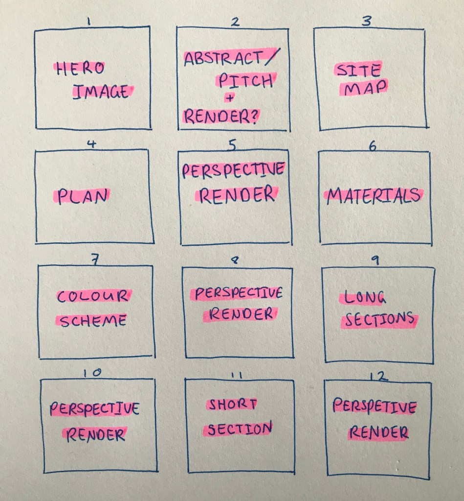
After this I made a basic layout example of how I thought would be best to show my design.
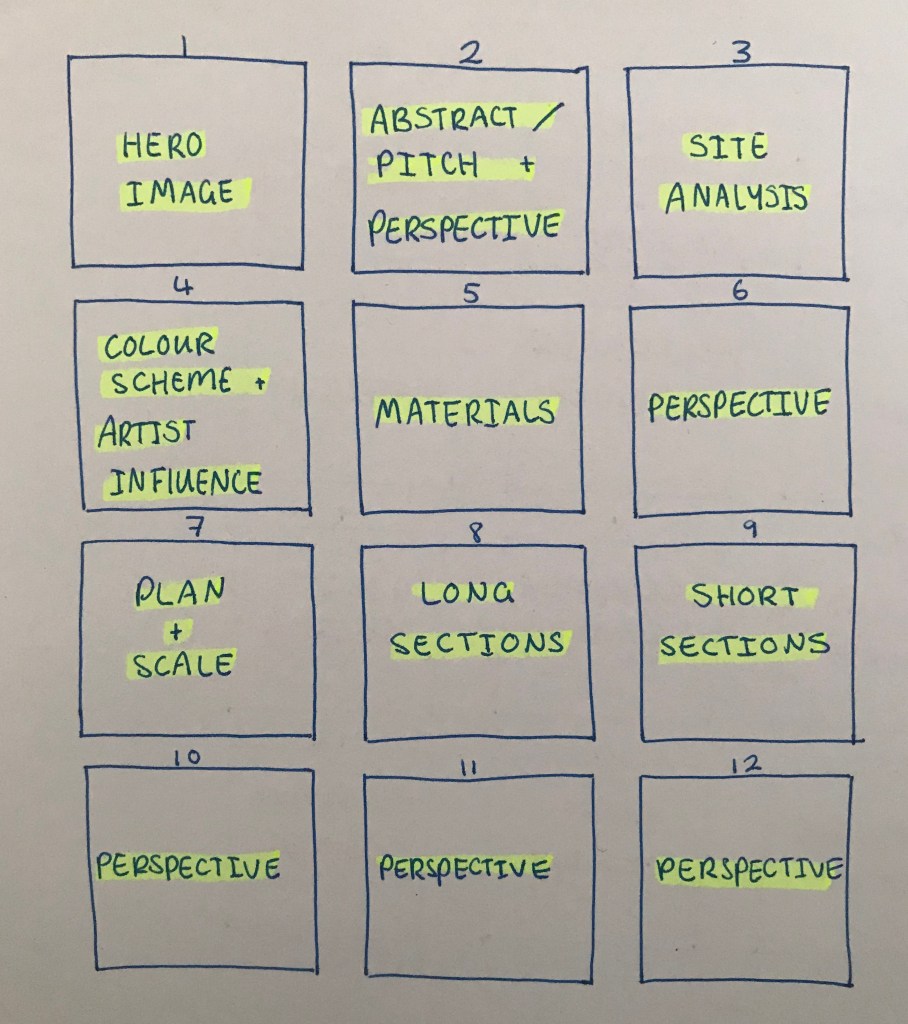
Once I started to put together the presentation I decided to change things around a bit as the order didn’t feel like it flowed nicely. I moved the perspective images to the end and put the exploration pages (colour, materials, sections) earlier in the presentation so it made more sense chronologically.

Leave a comment