
After the co-design workshop there were a few changes I wanted to make. The first was bringing some elements of the design further into the lane to force interaction with the installation. I tried extending some of the exisiting panels but it felt awkward and I wasn’t a big fan so I decided to try creating another set of panels on the other side of the lane instead. I think these looked a lot better and they loosely mimicked the panels on the original side but with more sporadic spacing between them. There is more variation to the new panels than the original with some extending above the backing wall and the distance they extend out into the lane varying from panel to panel.
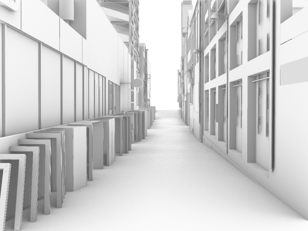
Initial Design – from Customs Street East 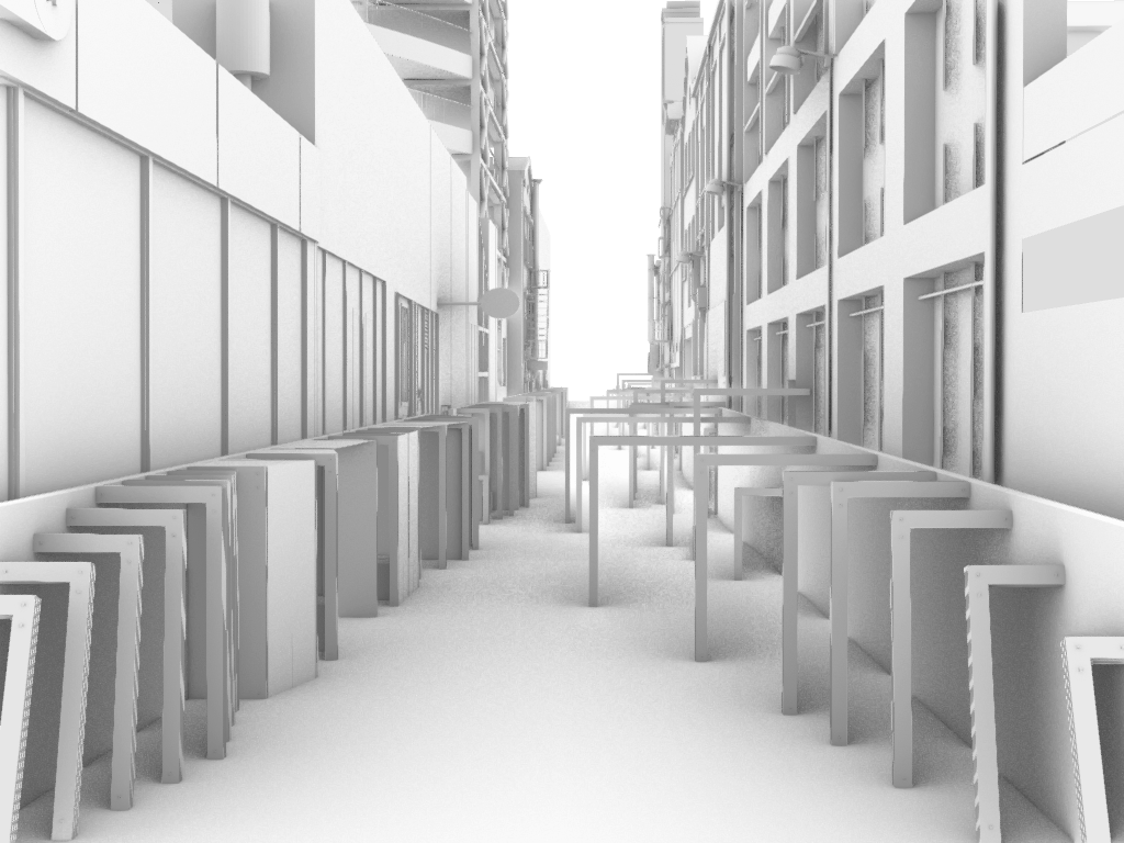
Additional Panels – from Customs Street East 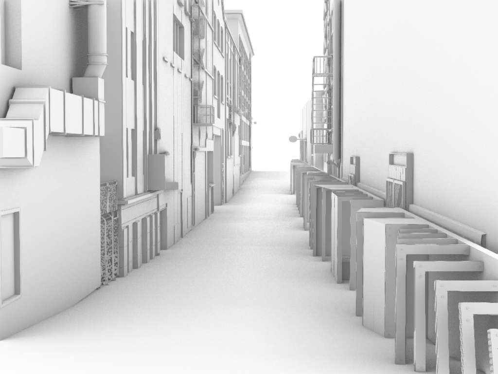
Initial Design – from Fort Street 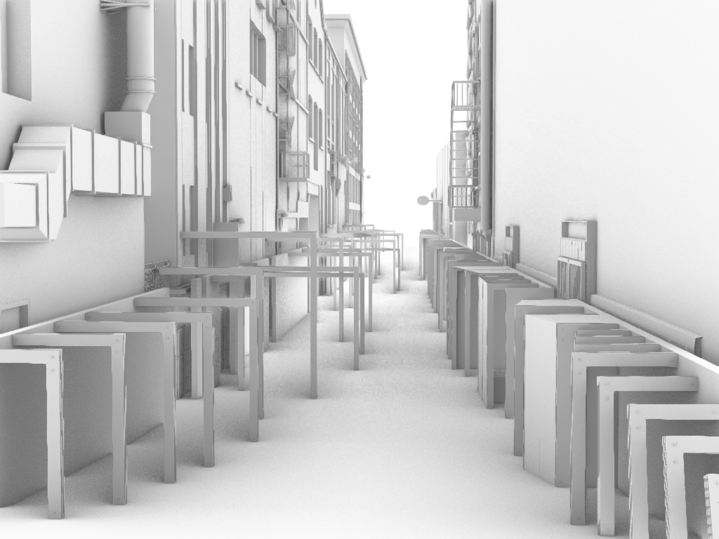
Additional Panels – from Fort Street
The backing wall on the new side felt a little flat so I started to play around with adding some angled walls into it in an attempt to reflect the taller elements of the site, similar to how my image sequence did. The look of this took some trial and error to get right but I was happy with the outcome and the effect it creates as you move past. Instead of only seeing the reflection directly beside you, the angled wall picks up the reflection as you approach, move past or sometimes not at all depending on the angle. I like to think of this as version of the person in different realities moving in and out of what we are able to see.
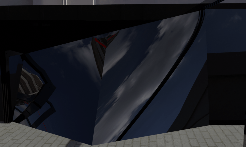
Rendered unedited angled wall 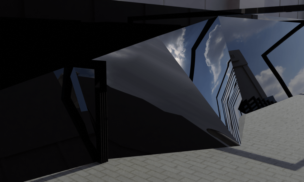
Rendered unedited angled wall 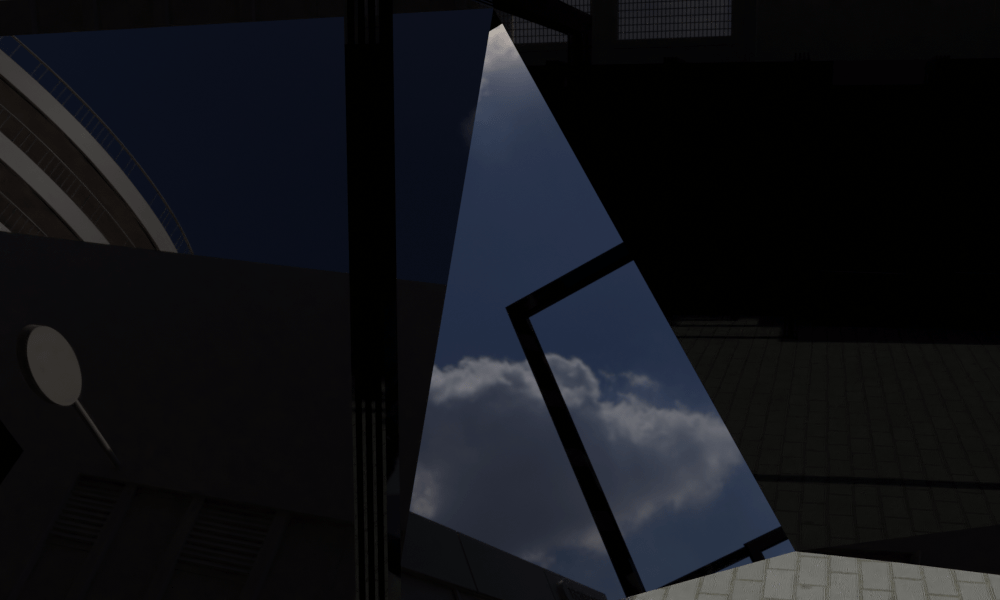
Rendered unedited angled wall 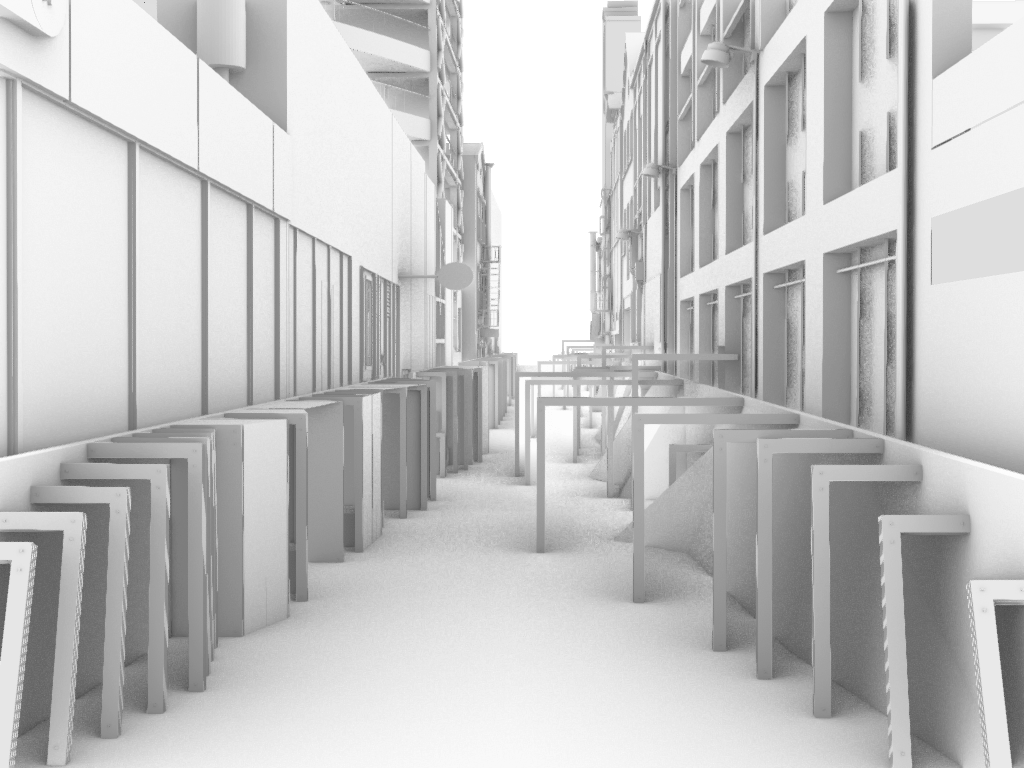
Rhino model showing addition of angled walls 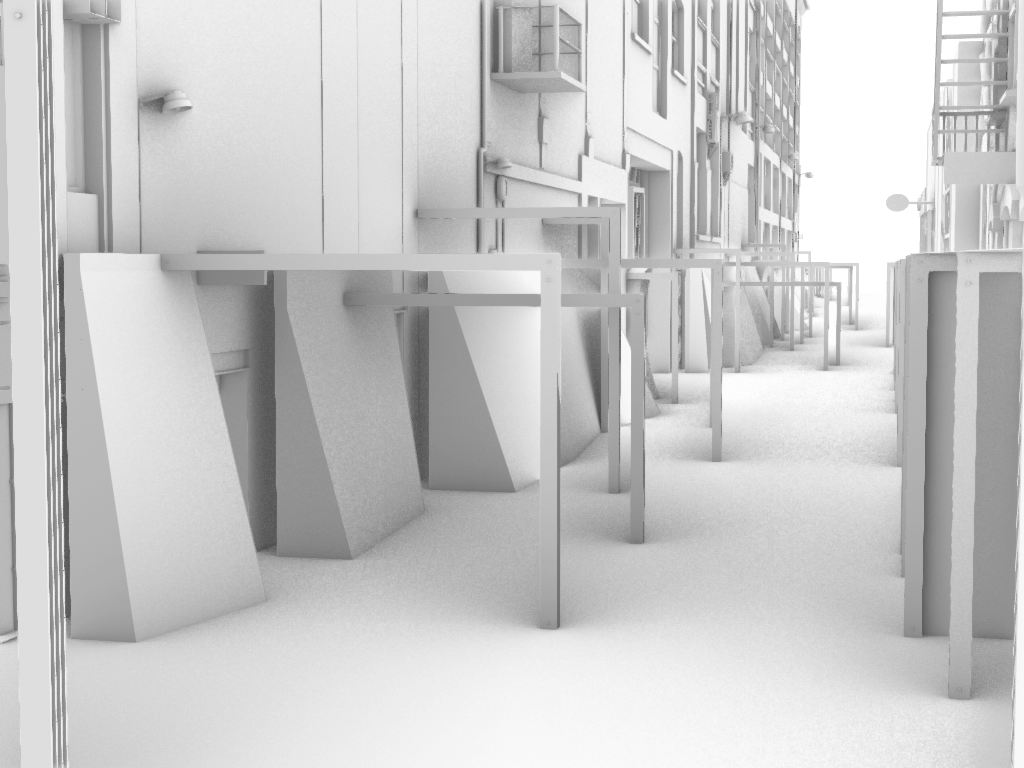
Rhino model showing addition of angled walls
Now the installation runs down both sides of the lane instead of just one and this makes the space feel both wider but also more compact in some ways. The reflective walls on either side create an infinity space to either side but the panels extruding into the lane interrupt the usual movement pattern. The original side of the lane feels very structured, systematic and repetitive with the smaller scale making the space feel secure. The new side has a sense of freedom, and the open space and larger scale is more daunting. I think they compliment each other well and show both sides/feelings.
I also introduced LED lighting into each of the panels with the idea that these would be solar powered lights that come on at night only. This creates further variation in the design from day to night, makes the space brighter and more welcoming at night and introduces an element of colour. When thinking of sci-fi and what colours I associate with that I generally think of red, blue green and orange. I tested them out and decided to go with the blue for a few reasons. Firstly given the history of the site I didn’t want to use red and the connotations of the red light district. The green reminded me too much of Star Wars and the orange I just didn’t like. The blue ties nicely back into the image sequence which largely reflects the sky. During the day the angled walls reflect the sky and bring the colour into the site that way but at night the lighting takes over. However I wanted to use a few shades and eventually settled on using a dark and light blue along with a white. The lights enhance the reflection of the panels against the backing wall and help create a more vibrant door like illusion.
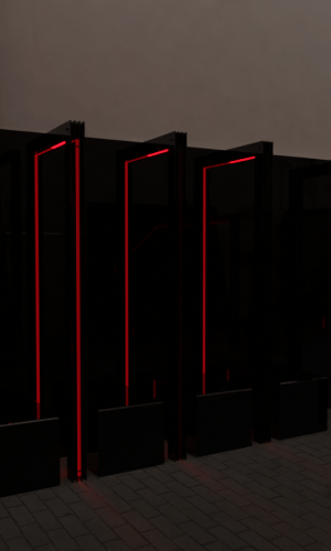
Red lights 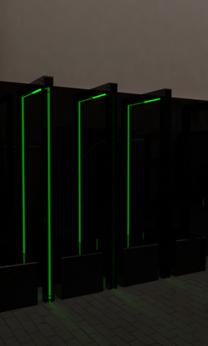
Green lights 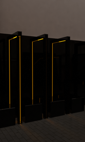
Orange lights 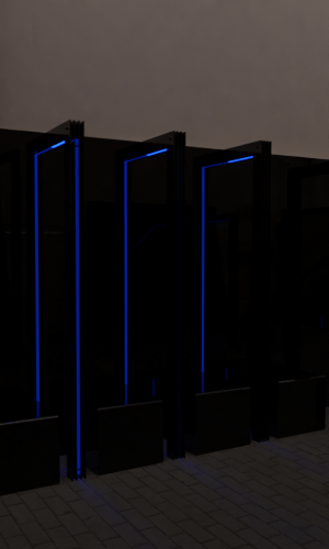
Blue lights 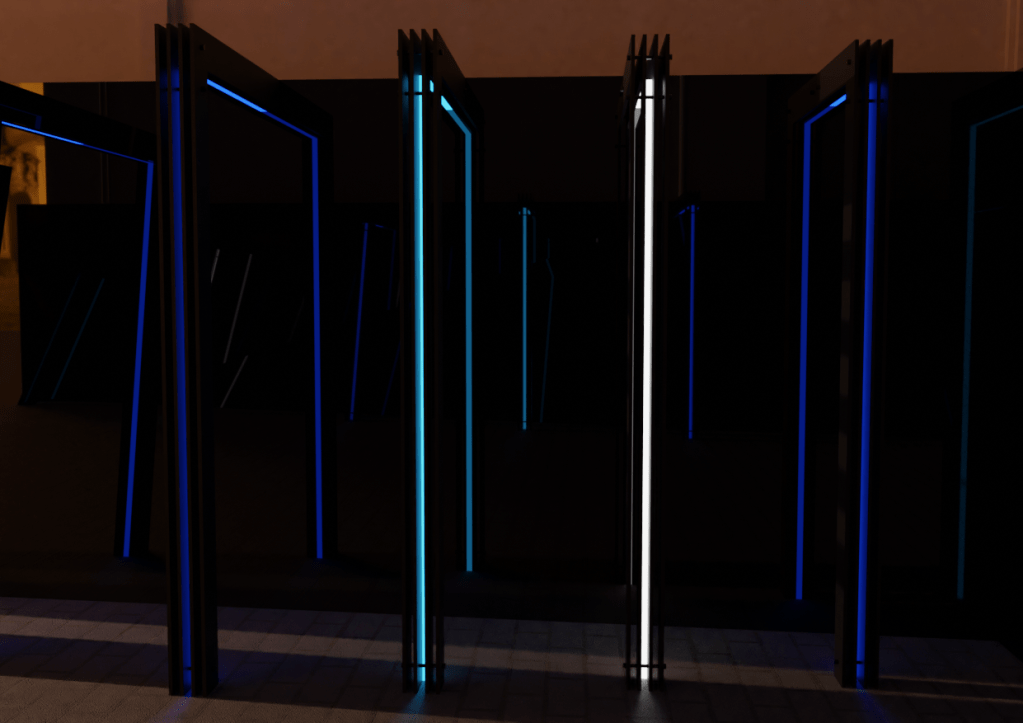
Final lighting colours
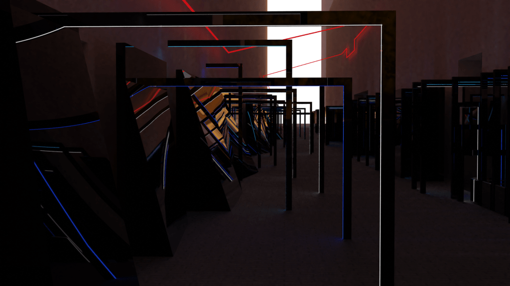
Once these changes were added into the digital model I went back into Blender to render new perspectives. I had to work slightly different to normal as my laptop struggled to load and render the full model of Fort Lane. Usually I would be able to use the desktop computers at uni that have more power and can generate more detailed renders. I was able to work around this by leaving the materials off of the exisiting buildings of the lane and only applying them to my installation. I actually quite like how this turned out as it allows for the detail of the exisiting buildings to show through and to be in the rendered reflections but it stops them from overpowering my design through too many materials being in the render. This also reduced the time my renders took and I was able to produce them all relatively easily.
Unedited render – night 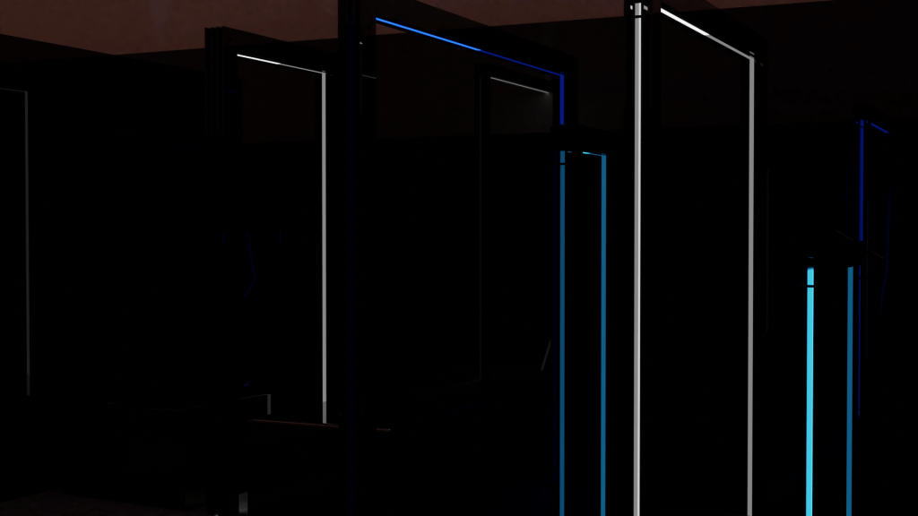
Unedited render – night 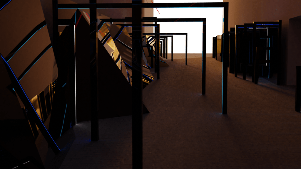
Unedited render – night 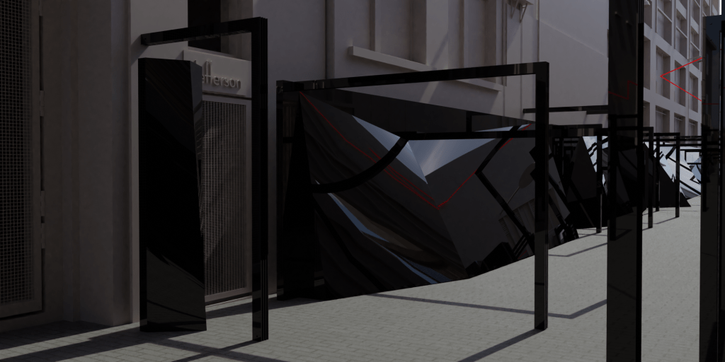
Unedited render – day 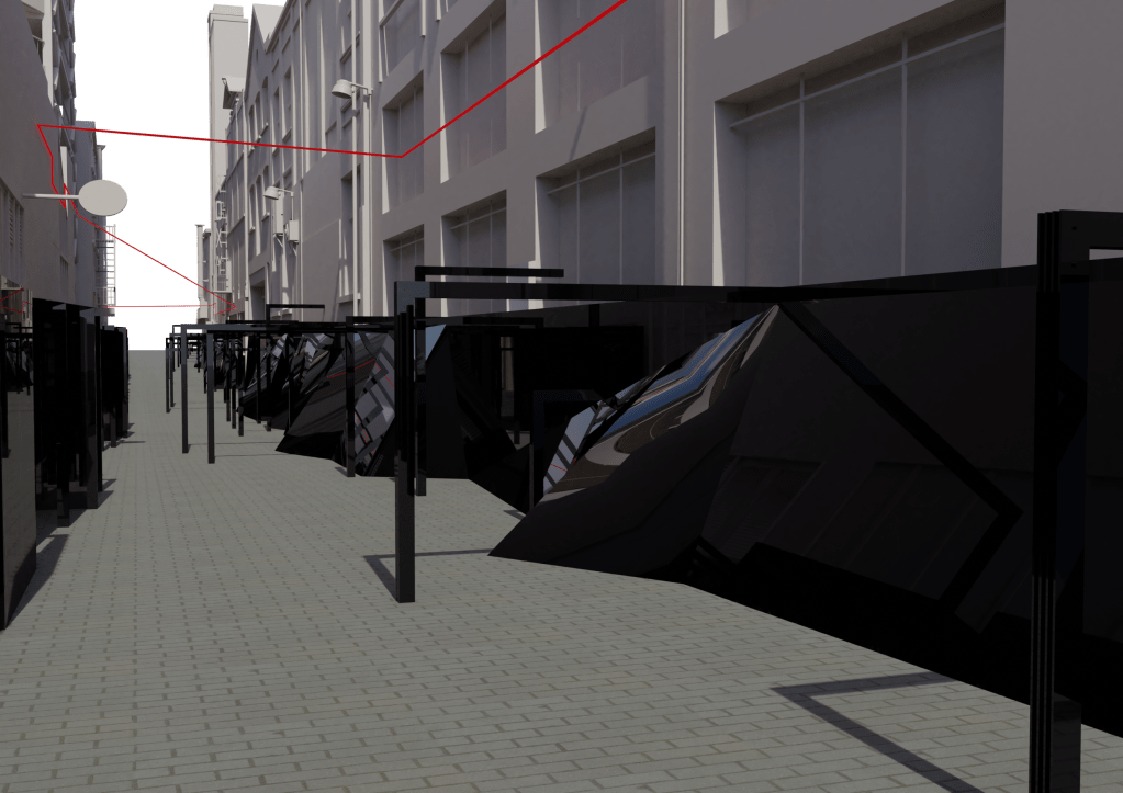
Unedited render – day 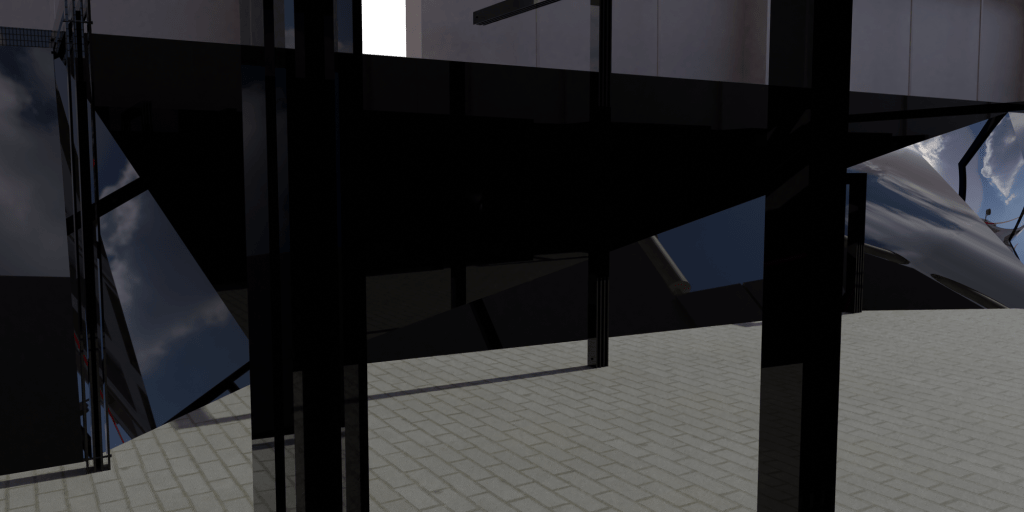
Unedited render – day 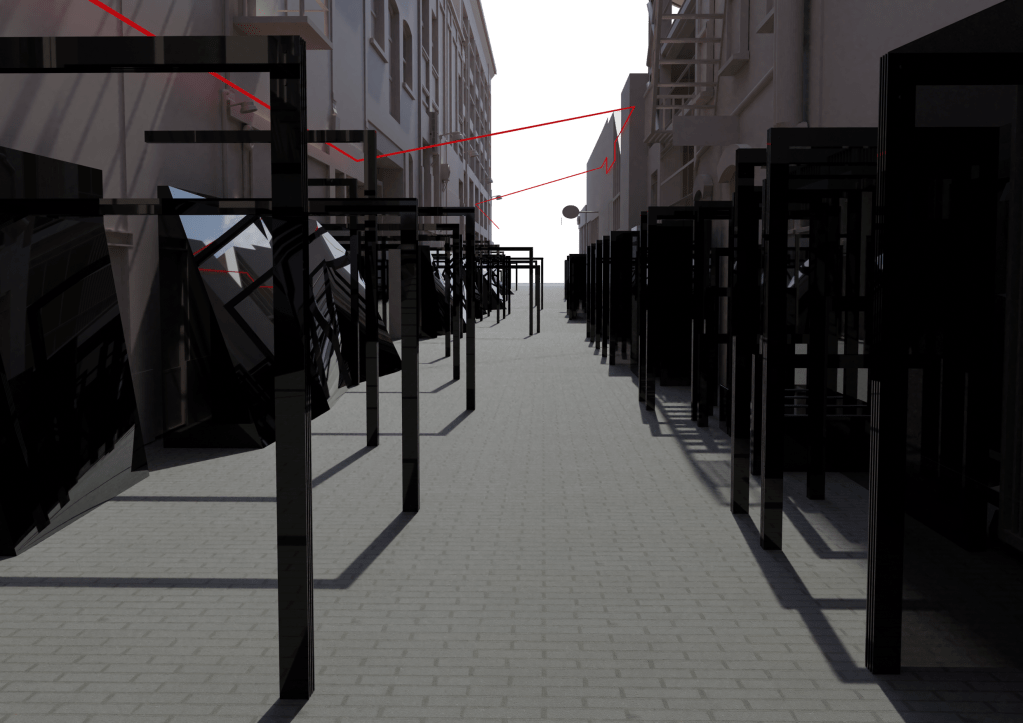
Unedited render – day 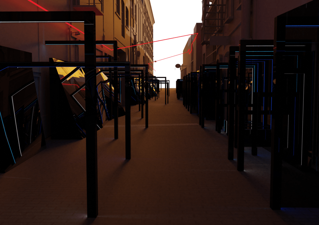
Unedited render – night
Using a combination of Rhino, Illustrator and Photoshop I generated new plan and section drawings showing the new elements of the design. This is usually a simple step in the process but this time it was stressful and time consuming as for some reason Rhino was not cooperating in producing line drawings from the digital model so I changed to trying a rendered view. I can’t count the amount of times the programme crashed on me and that saved versions of the file got corrupted, meaning there were a lot of things I had to re-do more than a few times. In the end though I managed to get everything I needed and produce a set of drawings that all work well together in my opinion.
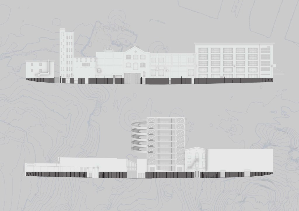
Sections 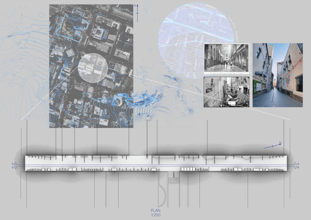
Plan
This week was spent laying out my presentation and I’m happy with how it turned out. There were several major changes from the co-design workshop presentation having taken on the advice from Lizzi in that session. I especially tried to detail the exisiting site better through maps and images over time.

Leave a comment